
The Key Metric Overview dashboard compares data from all key metrics you are using (up to 5) to the number of deficiencies during that time frame.
Instructions:
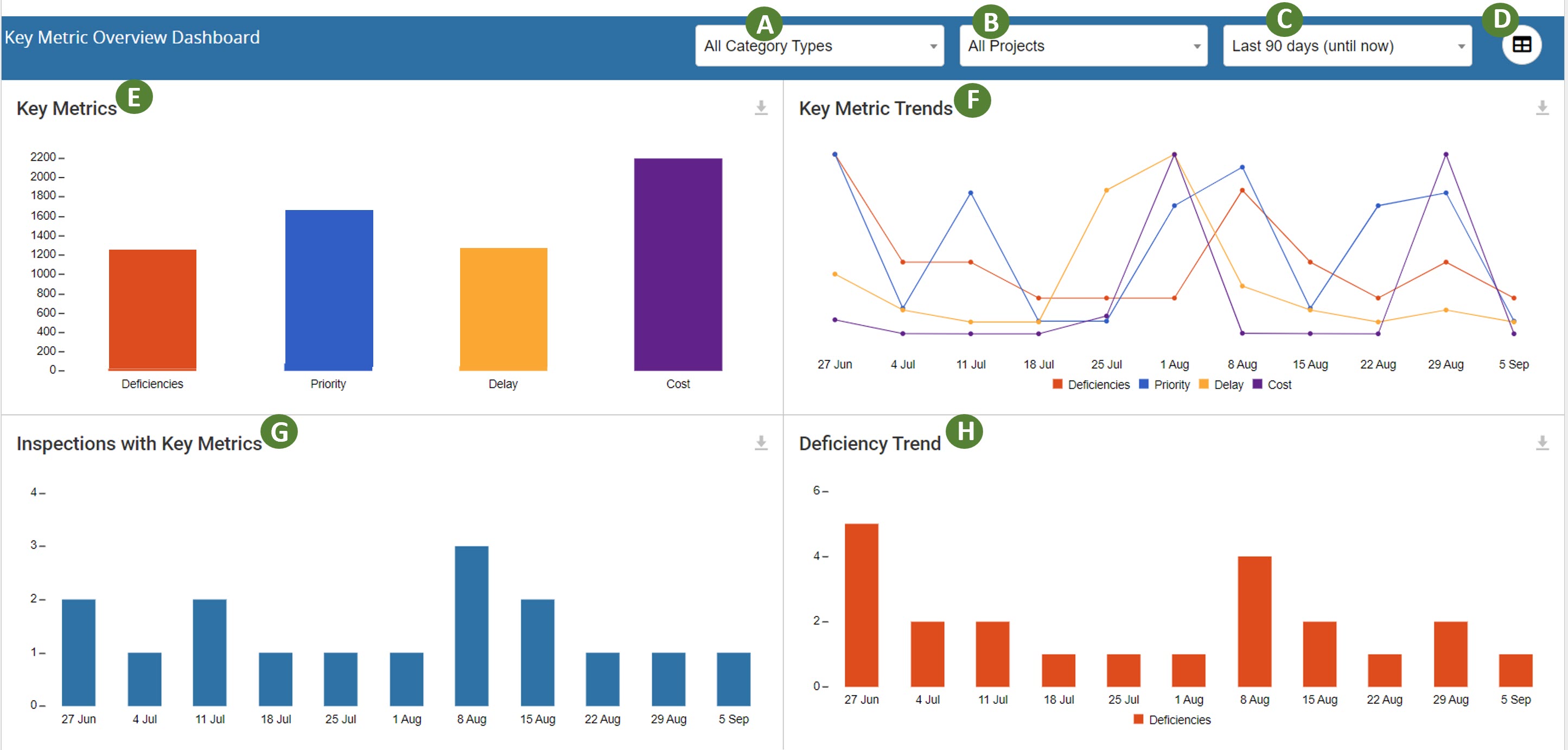
A. All Category Types: Dropdown to choose between Quality data and Safety data.
B. All Projects: Dropdown allows you to chose to show data for all projects or a single project.
C. Last 90 Days (until now): Drop down allows you to choose a timeframe.
D. Chart Icon: Opens a window to customize the dashboard. You can select which panels appear on the dashboard, turn off panels that you don't need, and reorganize the order of the panels so the most important info is on top.
E. Division: Ranks each Key Metric by Division. Click a specific division title to sort the dashboard data by that selection.
F. Key Metric Trends: This line graph compares all Key Metrics within the time frame. Click the Metric in the legend to remove/add the data from the line graph.
G. Inspections with Key Metrics: This bar graph shows the number of inspections within the selected time frame that contained key metric data.
H. Deficiency Trend: Bar graph that shows the number of deficiencies within the selected time frame that contained key metric data.
Other Panels: The additional panels are breaking down a specific key metric. Each panel focuses on one metric.
- Every component on the dashboard is clickable and can filter the data by the clicked item.
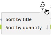 Click this icon to sort by the data by title or by quantity.
 Click this icon to download the data into a CSV file.
Comments
0 comments
Please sign in to leave a comment.